

Trend Fatigue? Never!
Are interior design trends worth following?

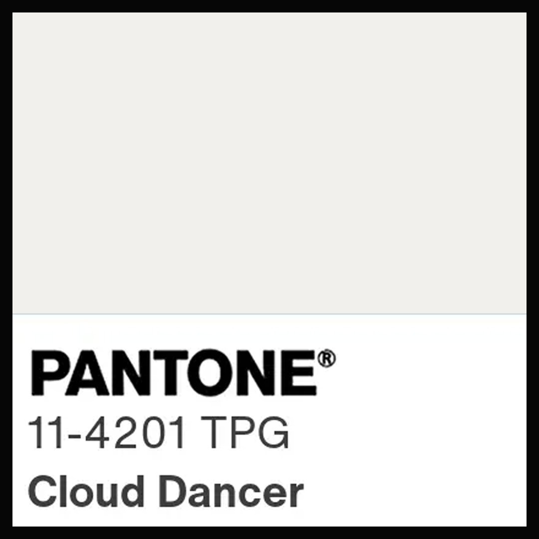
Stitch Fix, the online personal styling service, recently reported that up to two-thirds of their customers are suffering from “trend fatigue”. Pantone has echoed this sentiment by declaring their colour of the year 2026 to be Cloud Dancer, a bland shade of off-white designed to provide a calming refuge free from external distractions. This is not surprising, considering the cascade of micro-trends fashion followers have been bombarded with over the past few years, from Gorpcore and Mob Wife to Whimsigoth and Coastal Grandma. Naturally, social media (especially TikTok), with their tendency to simultaneously divide their users into teeny-weeny pockets of interest and to broadcast their content across a huge audience, are to blame. Whist most of this trend proliferation originates from the fashion ecosystem, the world of interior design has not been completely immune. Dedicated trend-chasers may recognise a few of the following:
Material Madness


The story started sometime in the mid-naughties, when marble became trendy. Once used primarily for tiles and kitchen counters, suddenly there was marble everywhere from furniture and lighting to an endless array of tabletop accessories. This commercial success seemingly unleashed designers’ imagination and the use of “alternative” materials went mainstream. This is especially the case at design schools, where the use of experimental and recycled materials is now so commonplace as to be completely unremarkable. The trend reached its zenith with terrazzo, a man-made composite commonly used as a cheap flooring material but which is now featured in high-end designs such as the Taiko Tables from Stellar Works and the Palladio Wall Light from FABR.
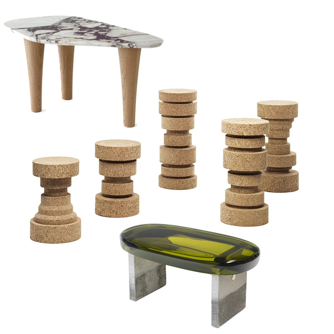
Other materials enjoying their 15 minutes of fame include concrete, cork and resin. Whilst some of this experimentation is driven by the laudable search for sustainable alternatives to carbon-intensive materials such as steel and plastic, much of it is frankly down to novelty value. As our attention spans continue to shrink, expect to see designers and brands pushing increasingly exotic materials applied to unexpected places. Mycelium leather upholstered sofas anyone?
Curvy Couches with Boucle and Balls


Perhaps in reaction to the long-running obsession with mid-century sofas in weird shapes (see Camaleonda), furniture brands have gone all out for sleek, curvy sofas in recent years. Brands from Tacchini (with its popular Julep sofa) to Moroso (where Patricia Urquiola introduced curvier versions of her Pacific and Gruuve sofas) have bucked the established stereotype of boxy Italian sofas.


Running concurrent with the curvy sofa trend is the emergence of boucle as the upholstery fabric of choice. Beloved by Coco Chanel (who frequently used it for her iconic jackets), boucle has a rich, textured surface that works particularly well with a melange of colours. This emphasis on uncluttered design and comfort with a luxurious feel neatly echoes quiet luxury, the dominant fashion trend of the past few years.


The trend comes to a full circle with the ball-shaped cushion, which at some point seemed to have adorned every other sofa. More for hugging than for back support, and thankfully immune to cushion-chopping, they are perfect for curvy sofas, especially when upholstered in boucle. However, all trends eventually fade out. Could curvy sofas be heading towards the off-ramp of the fashion highway?


It is worth noting that the most hyped sofa of the minute is the OMHU Teddy, a “boneless” sofa-bed made of two boxy foam mattresses stacked on top of each other with sausage-shaped back cushions on top, all upholstered in corduroy fabrics in a range of vibrant colours. Could this be the start of a new viral trend?
Colour Drenching and Dopamine Decor


Colour drenching is the practice of covering an entire room and its contents, from ceiling and walls to shelves and carpets, all in the same colour. The visual impact may be stunning, especially when seen on an Instagram feed, but is it actually nice to live in a space where you get no respite from one shade of colour, however much psychologists talk up the benefits of colour therapy? Colour drenching may sound extreme, but it is not the only example of interiors designed to change your mood.
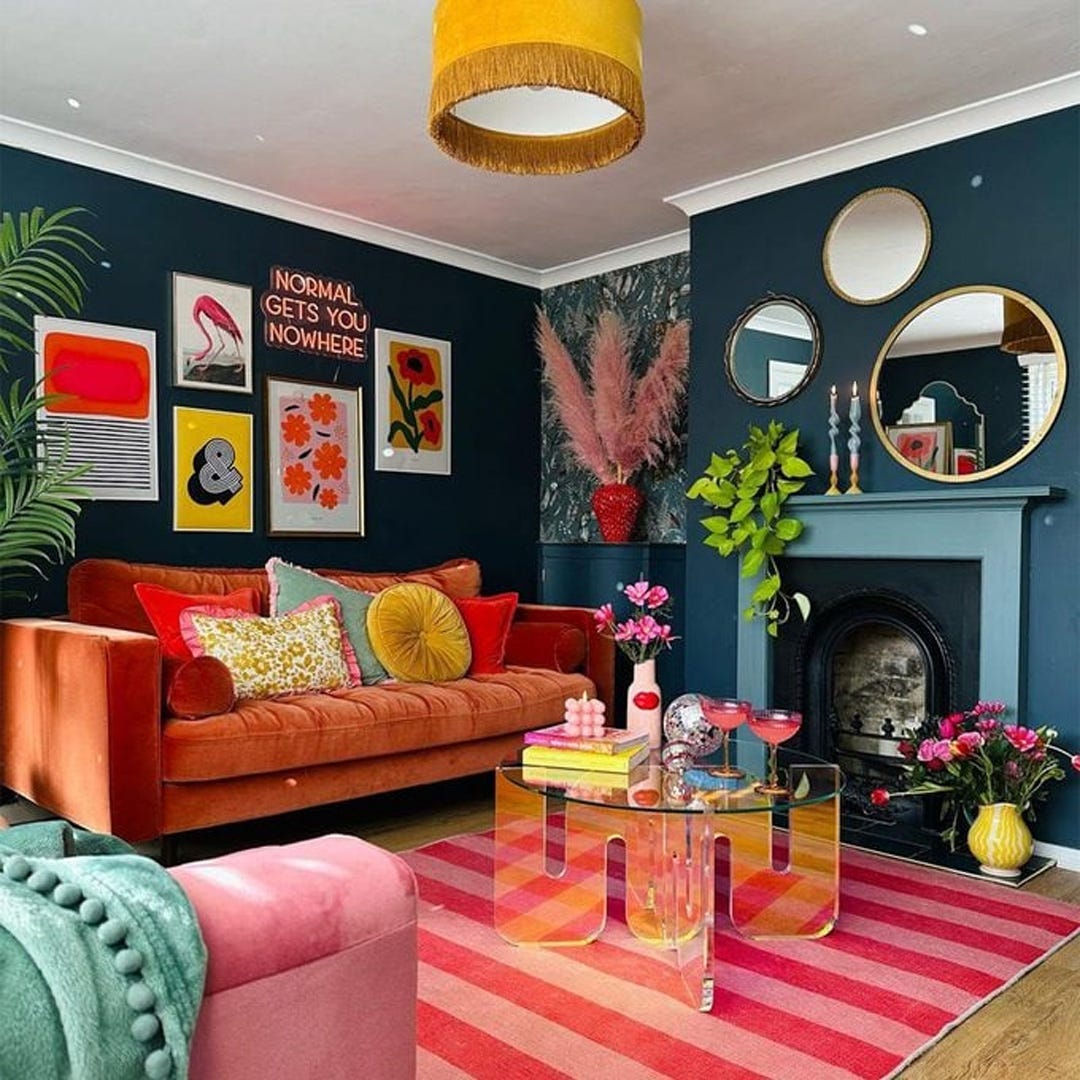
Bright colours are known to generate hits of dopamine, the hormone responsible for feelings of optimism and happiness. This may explain the popularity of the dopamine decor trend (146k posts on Instagram). Think vivid colours, lurid patterns, quirky accessories and not a spot of beige in sight. This style has a storied lineage that traces back to maximalism, post-modernism and all the way to Victorian eclecticism - dopamine decor is but the latest iteration packaged for a social media savvy audience.


If you want to add a bit of fun without overwhelming your space with clashing prints we would recommend choosing one or two pieces of statement furniture, such as from Scarlet Splendour’s Garden Collection or the Pixel Cabinet from Boca do Lobo, which are bound to get the conversation going at dinner parties.


Alternatively, Seletti has a great collection of bright and quirky designs such as the Supersquaretable, the Vitamin Pumpkin suspension light, the Tetris mirror and the Grace table lamp which will cheer up your space without breaking the bank.
From Armani to Batman
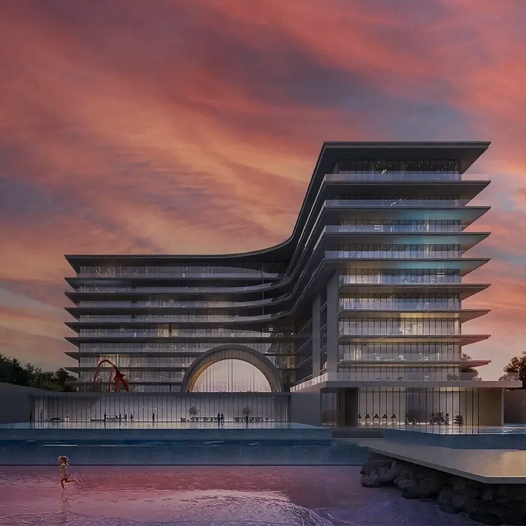
If money is no object you might wish to indulge in one of the most striking interior trends in recent years: the move of luxury brands into design. Luxury fashion brands such as Hermes and Ralph Lauren have been selling homewares for some time, but the past few years have seen an explosion of full-blown furniture collections from fashion brands such as Bulgari, Versace and Dolce & Gabbana as well as luxury car brands such as Bentley and Bugatti. Some of them have also moved into branded luxury residences. Miami, for instance, boasts apartments designed in partnership with Baccarat, Bentley, Porsche, Fendi, Missoni, Armani and Aston Martin. Over in Dubai, over 200 such branded residence schemes are expected to be delivered by 2030. Admittedly most of these are brand licensing exercises, but this rush of luxury brand collaborations shows that as economic growth remains subdued, furniture and property companies alike are increasingly focusing on selling to the top 1%. What better way to lure high net worth individuals than to attach a well known luxury brand to your wares?


My personal favourite is Wayne Enterprises, a new brand established by Italian furniture company Formitalia in partnership with Warner Brothers. It is a collection of sleek and slightly mysterious furniture and lighting designed to evoke the style of Bruce Wayne / Batman. A luxury furniture collection built on the imaginary lifestyle of a comic billionaire - now that’s a lesson in lifestyle branding for you.
The Art of Design
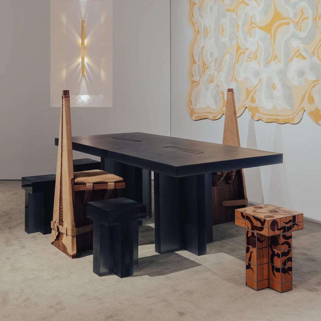
The ultimate manifestation of the focus on ultra rich customers is the rise of design art. Afterall, if you are a member of the 1% club, why settle for a console table from a luxury brand, even though it would be custom made for you, when you could grace one of your many houses with a unique collectible design? This is the premise behind the wave of design art galleries such as Friedman Benda and Carpenters Workshop that have blossomed over the past few years. They represent big name design stars and emerging design-makers alike, selling highly artistic works with a strong element of artisanal craftsmanship. As the market is still in its infancy, the long term value of most of these creations are not assured. Even so, if, for the price of a similar item from a top design brand you can get a unique object more akin to a work of art which might even increase in value in the future, what’s not to like? We expect this trend to continue, possibly with the market broadening to include more emerging designers at lower price points.
Trends come and go, and often come back in a cycle. At the end of the day, do they really matter? Design furniture is not really like fashion. Furniture prices tend to be higher, their replacement cycles longer and the logistics of delivery more burdensome, so we can’t really expect consumers to buy a new sofa every time a new viral design drops. Crucially, it is less easy to show off a newly redecorated room on social media than it is with a new handbag. Even so, there is nothing intrinsically wrong with following trends - it offers you a sense of community and an impetus to try something different. By all means have a go at following the latest TikTok famous trend, as long as you don’t lose sight of why you are seeking change in the first place. For us it is always the same: to create a happy home.
For more on-trend and trend-defying designs come visit us at www.do-shop.com.
Without reading your article and just looking at the design trends you curated, I feel like Pantone got it wrong, mostly.
I love your thorough explanation of recent design trends that are anything but white.
The white “trend” in interiors, fashion and design, is just a response to the over stimulation of looking at our screens all day.
Color drenching is the same response. With all of the notifications, emails, and reminders our brains are looking for a monotone look for attention restoration.
Great read for the designer, untrained eye, or trend exhausted!
Next time I open a bottle of wine, if its top is still in cork, I shall enjoy my 15 minutes of fame by sitting on it !
😆