

In Praise of Beige
Just don’t call it magnolia


Beige has a bad rep. Seen as banal, bland and boring, it has long been derided as the plebeian colour of choice. Minimalists prefer the purity of white, adventurists flaunt their daring with colourful feature walls, but only design novices and uncaring landlords cover their walls in magnolia. Yet beige, very loosely defined as a light shade somewhere between white and brown, is an incredibly successful colour. It is based on the colours of nature (think wood, soil, human skin) and is therefore soothingly familiar. Beige also comes across as less aloof and more stain resistant than white, which gets dirty as soon as you look at it, and is neutral enough to work well with almost every colour. The versatility of beige is the reason for its over-use, which is why it is seen as boring (see also the “sad beige” phenomenon).


But help is at hand - designers and paint manufacturers have worked hard to rescue the reputation of beige, first by broadening the hues available. The most successful example has been Greige, a cool greyish shade of beige or a warm, yellowish shade of grey, depending on whether you are a glass half full or glass half empty kind of person. First popularised in fashion by Giorgio Armani and championed by interior designers such as Kelly Hoppen, Greige is seen as a sophisticated neutral colour that works well in both contemporary and classic interiors.
The second strategy has been to rebrand beige. Cream, ecru, stone, taupe, off-white etc were good attempts, but the standout hit was Magnolia, a yellowish shade of beige popularised in the 1950s. So ubiquitous is Magnolia that it is now universally disdained, the way chocolate snobs sneer at people who like Cadbury Dairy Milk (which, by the way, is not technically classified as a chocolate in the EU). Since then paint brands have been giving increasingly exotic names to an ever broadening range of beiges, the most celebrated one being Elephant’s Breath (a Greige) from Farrow & Ball. On this note, let’s play Spot the Beige:
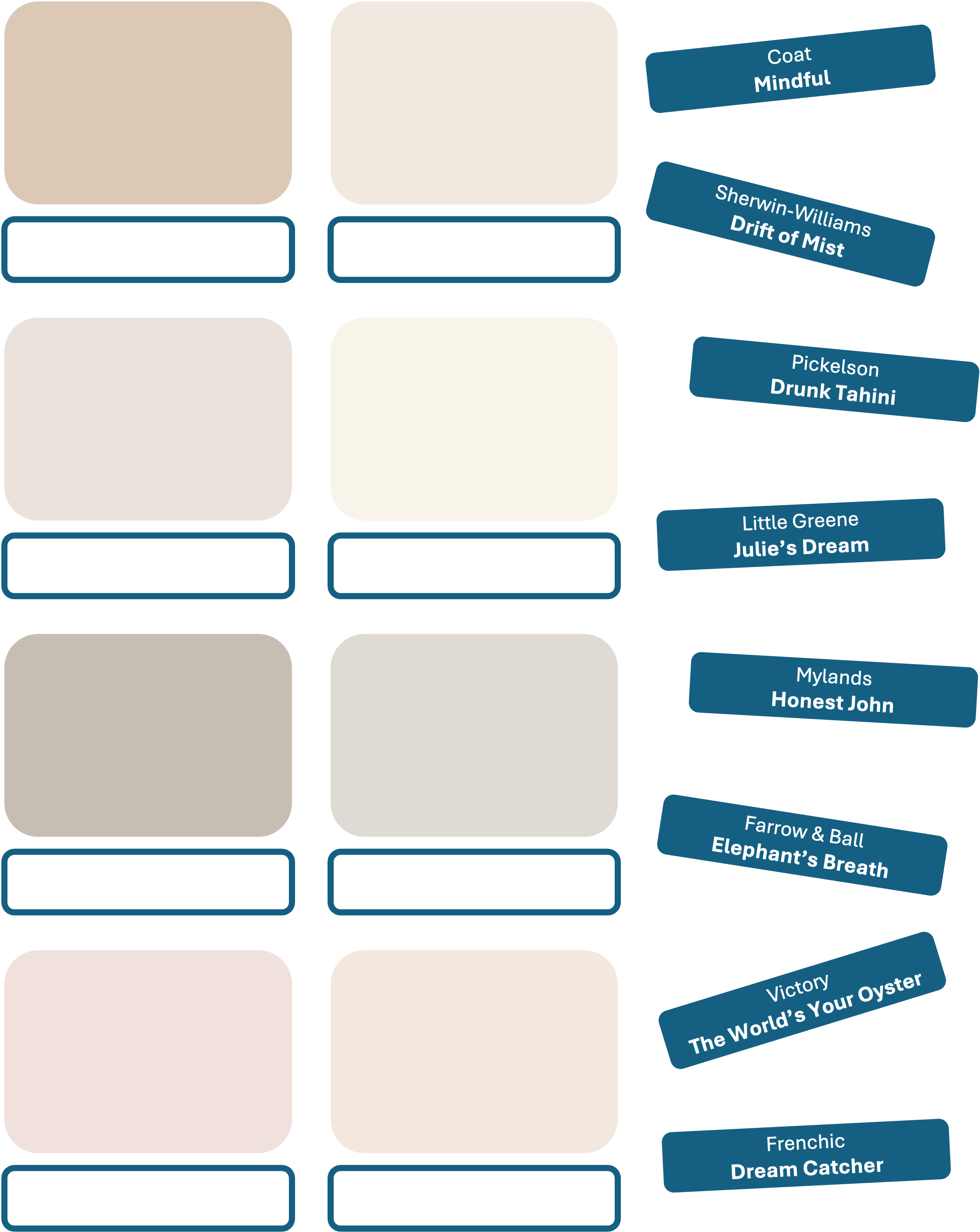
As you can see, the problem with beige now is less over-exposure and more option paralysis. As always, the solution is to disregard the marketing noise. Work out which shade of neutral your decor scheme leans towards (grey / yellow / pink / blue / green / brown?), get lots of test pots from multiple brands and have fun test-painting. If nothing works (or if you really can’t decide), there’s always Magnolia.
For more colourful product ideas and interior design advice head over to www.do-shop.com
... some call also beige "camel" 🐪 ...
Just to add another variation ! 😂